One research-backed design language for every Truist digital experience — a year-plus effort, now in finalization.
Role & context
Design Director over Truist.com - Design lead for this effort
I led a team of four design leads, reimagining the digital design language behind Truist.com - work I kicked off side-of-desk in 2025 and have driven from voc and research through a documented system (v2.2), now in its final stage.
The challenge
Across six digital platforms, Truist's experiences had drifted apart. Competing type scales, inconsistent color use, and one-off component patterns made things hard to find, harder to scan, and visually incoherent. There was no shared foundation teams could build on.
The approach
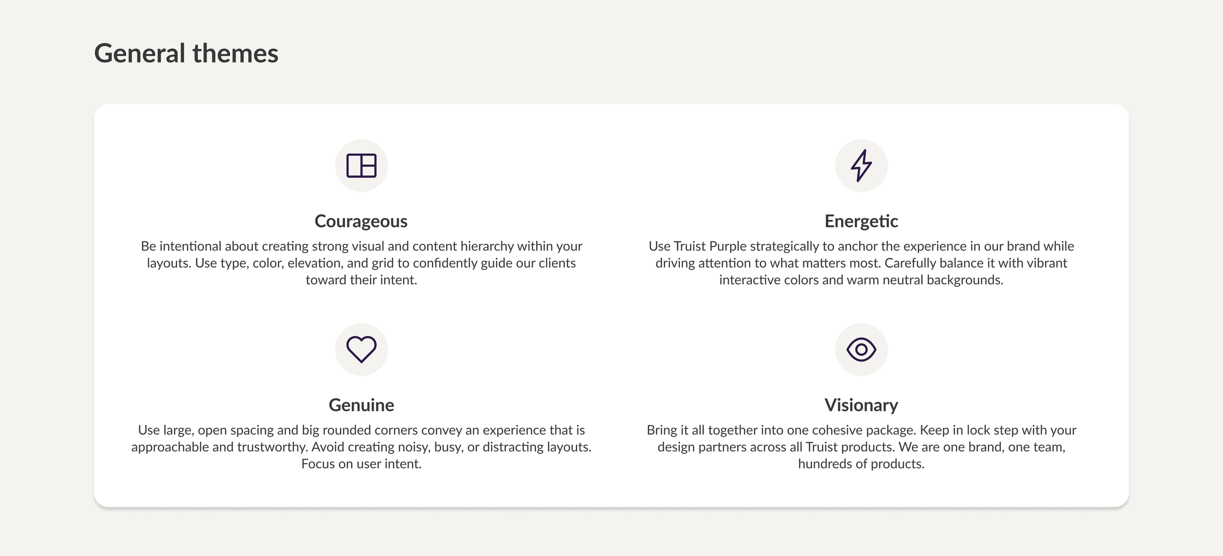
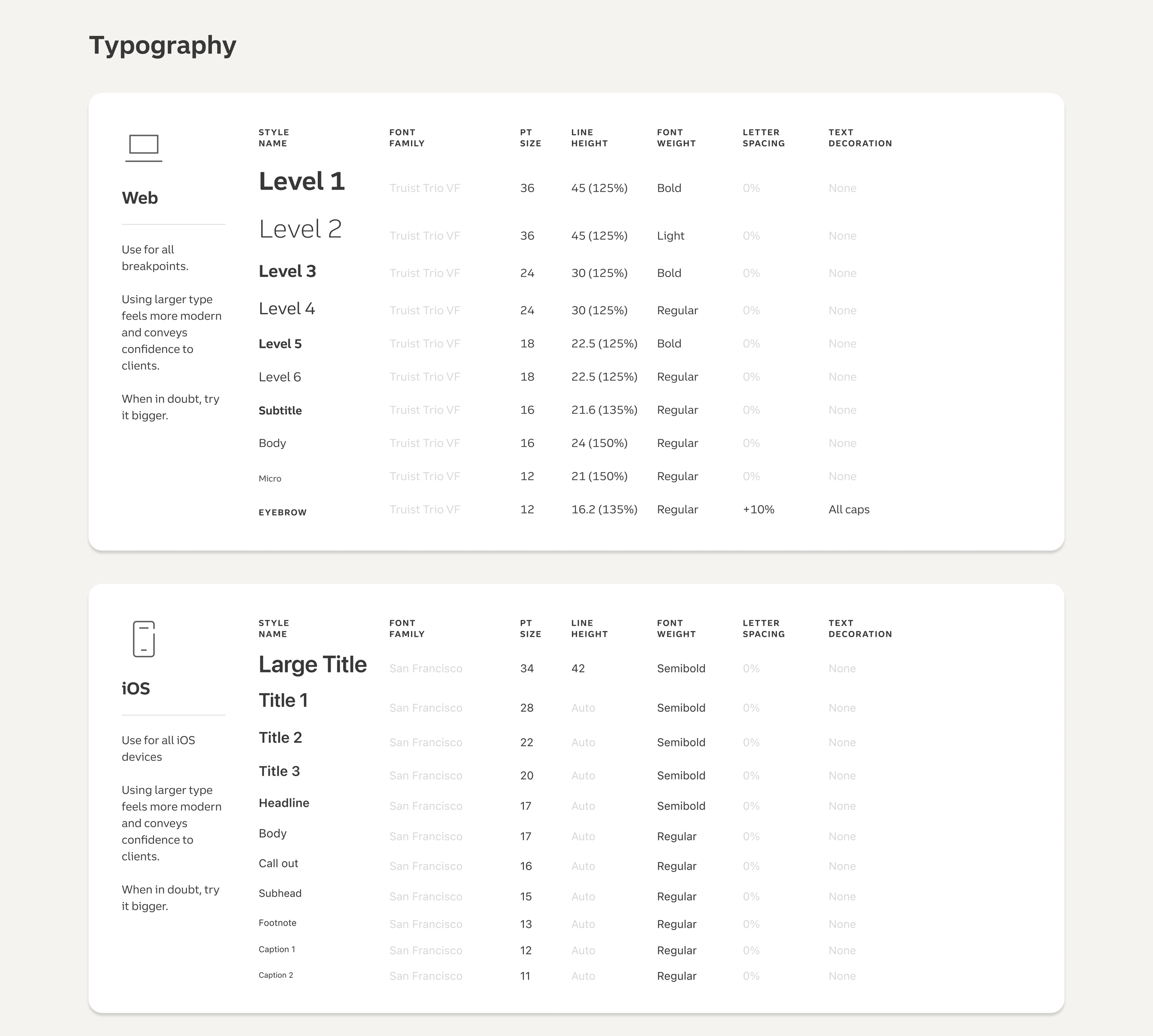
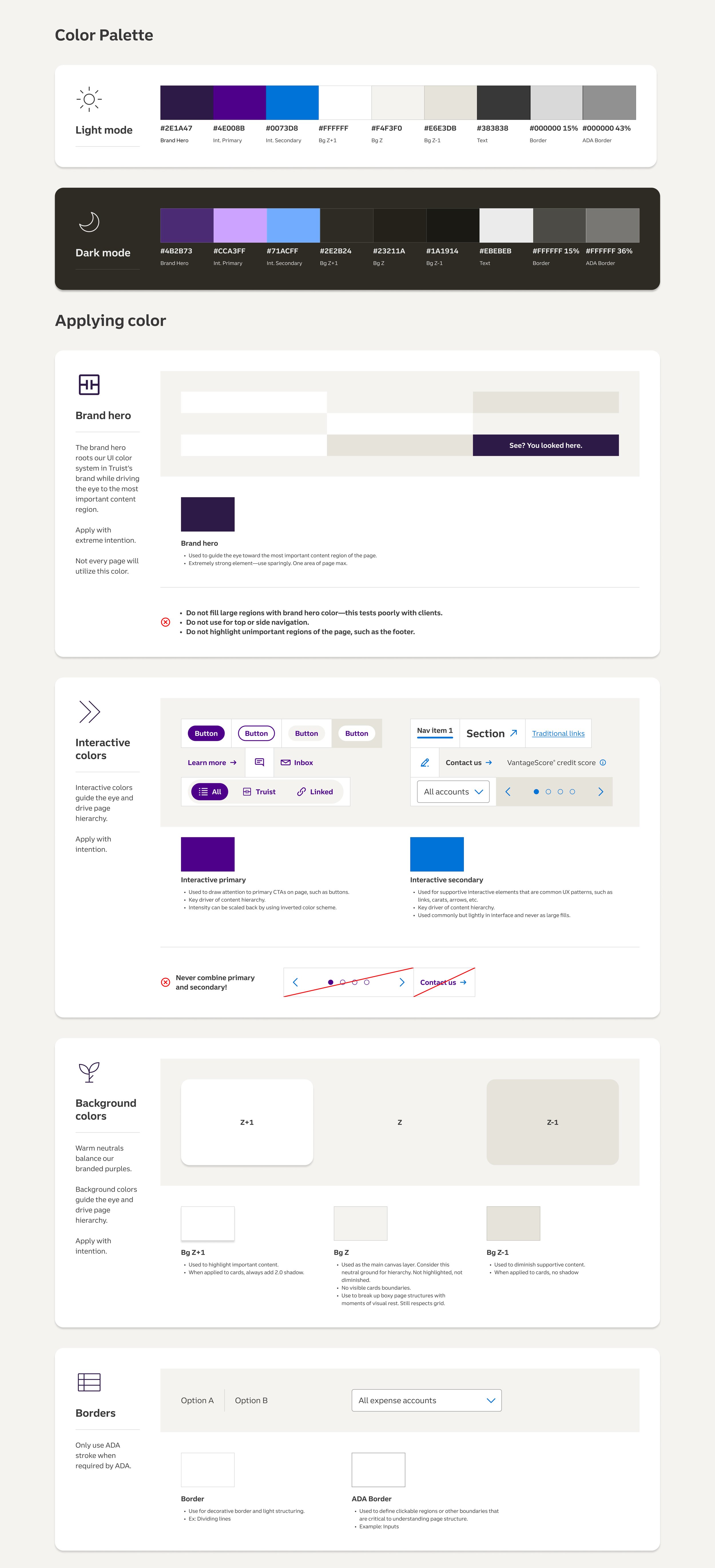
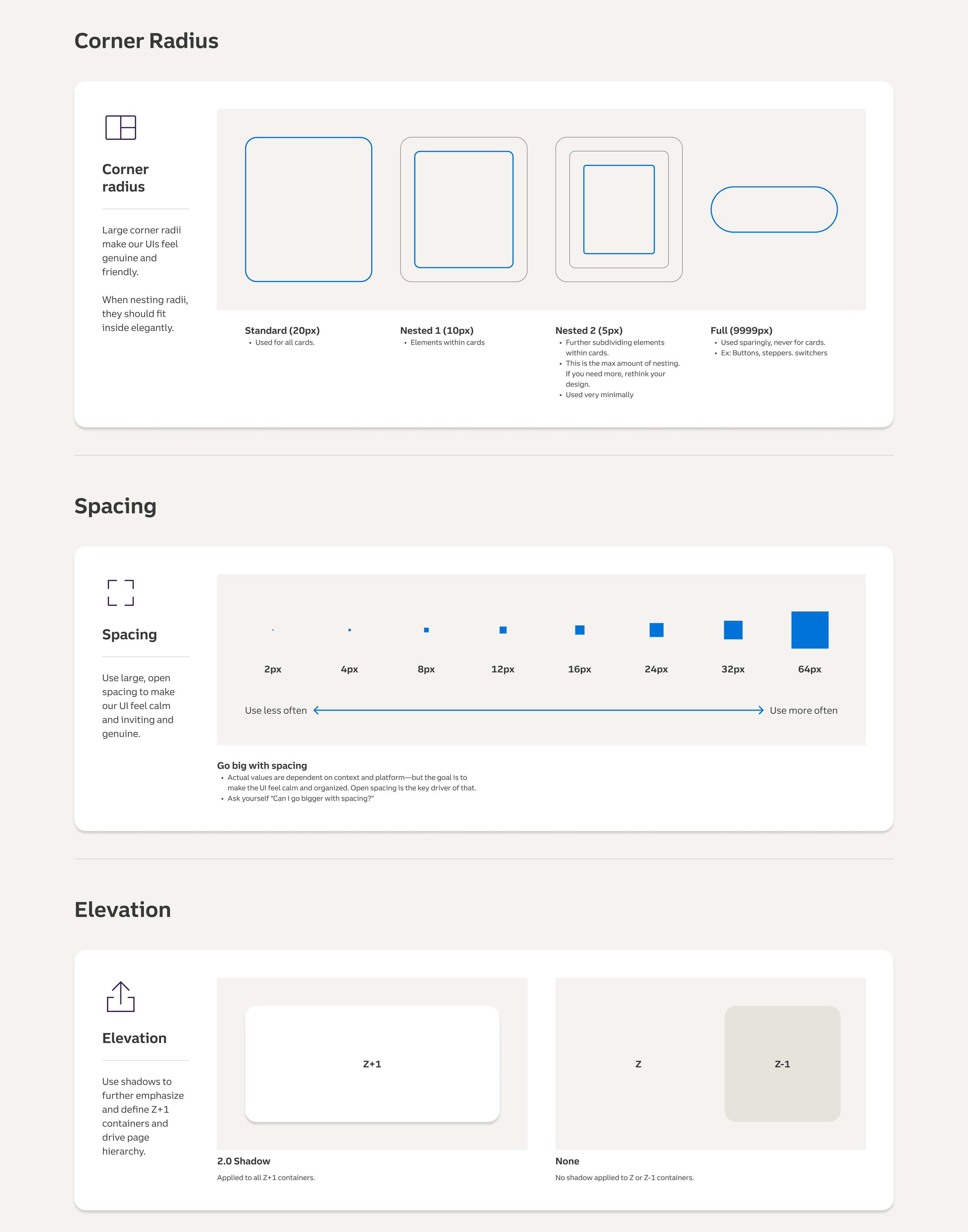
I grounded the work in evidence before design, leaning into VOC and user feedback. The team explored 20 concept directions through user research, identifying where the different platform’s painpoints aligned. From there, we defined the foundations end to end - themes, web and iOS typography, light and dark color palettes, rules for applying color, borders, corner radius, spacing, and elevation - and pressure-tested them against real product surfaces, from account dashboards to mobile flows.
Key design decisions
Making the Truist brand color show up better was a priority of the evolution, and a few deliberate moves got us there. I introduced a more vibrant, brand-forward interactive color plus a secondary blue interactive color, sharpening findability and visual hierarchy by making actions unmistakable. I also shifted the page background from a cool grey to a warm off-white, a complementary base that pushes elements forward and lets the Truist purple read far more powerfully across the site.
The outcome
Truist Design Language v2.2, now finalizing: a single documented system that gives every team a shared, accessible foundation and tightens visual and content hierarchy, findability, and usability across platforms.
Skills: Design systems · Design leadership · UX research · Color & interaction design · Visual & content hierarchy · Cross-platform (web + iOS) · Accessibility (light/dark)
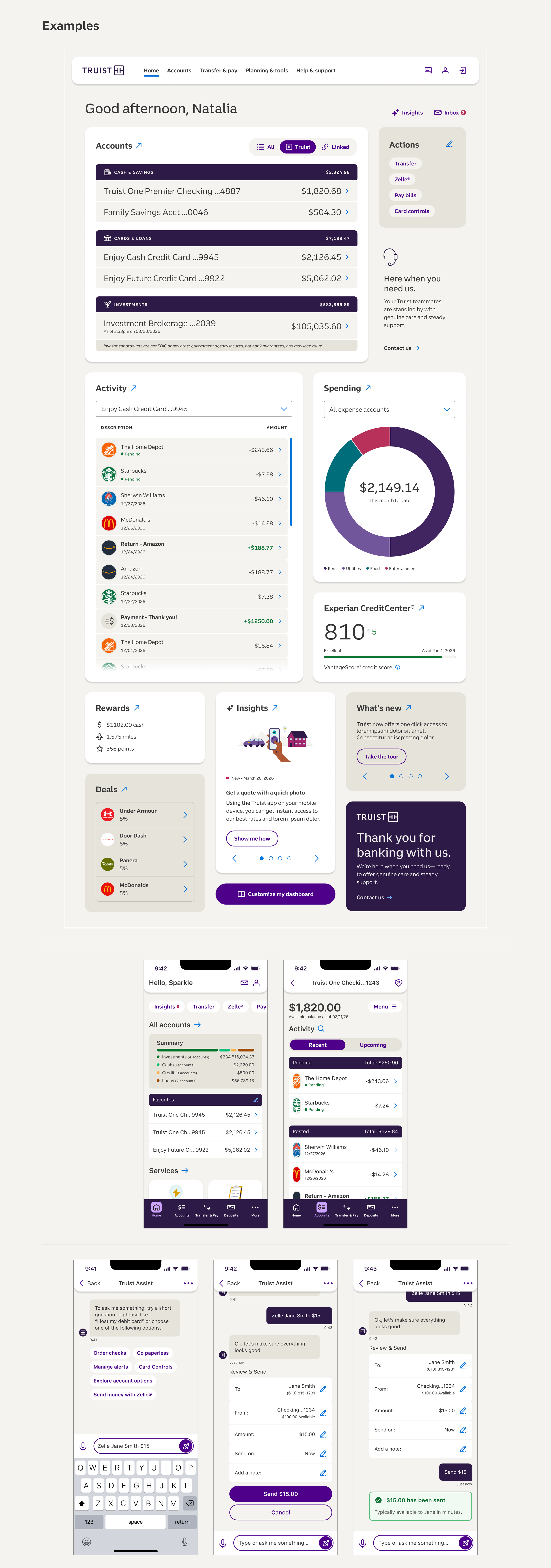
Bringing the new design language to life across Truist.com's most visible experiences - marketing pages, the online banking dashboard, and mobile.
Role & context
Design director over Truist.com - Design Lead for this effort
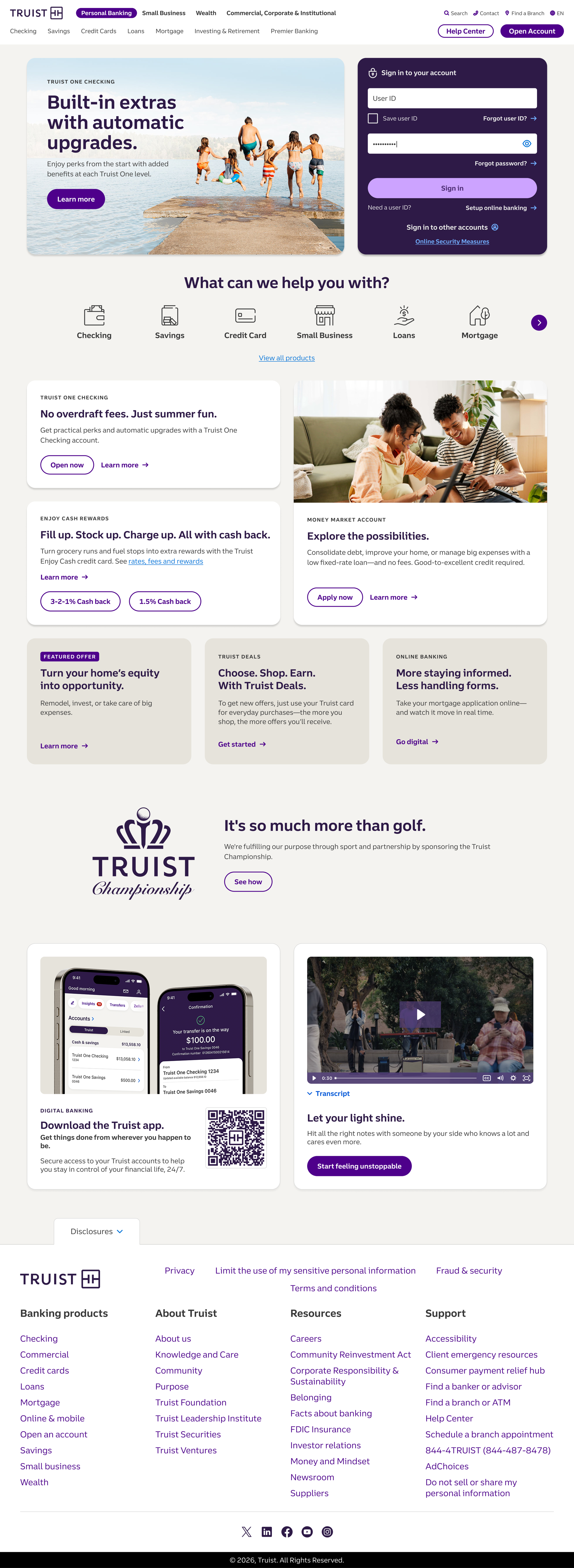
I adopted the new design language to both Truist.com and Authenticated experiences - applying the language to the homepage and Truist One Checking product pages. I also redesigning the Online Banking dashboard as a proof of concept with the new language. These were the flagship examples chosen to pitch Design Language 2.2 to executives.
The challenge
A design system only earns adoption when leaders can see it working on the experiences that matter most — from the highest-traffic marketing pages to the authenticated dashboard customers use every day. DL 2.2 had to prove it could carry brand, clarity, and conversion across both, on desktop and mobile.
The approach
I translated DL 2.2's foundations - typography, color, spacing, elevation, and a disciplined content hierarchy - into concrete, responsive designs. The homepage reorganizes around "What can we help you with?" for findability; the Truist One Checking pages turn dense product and disclosure content into a scannable, trustworthy story; and the Online Banking dashboard proof of concept carries the same system into the logged-in experience, across desktop and mobile. Together they became the proof points in the executive pitch.
The outcome
These pages became the centerpiece of the executive pitch for Design Language 2.2 - the tangible evidence that moved the system from concept toward rollout.
Skills: Design direction · Design systems in practice · Marketing + authenticated UX · Responsive web & mobile · Content & information hierarchy · Executive storytelling · Financial UX
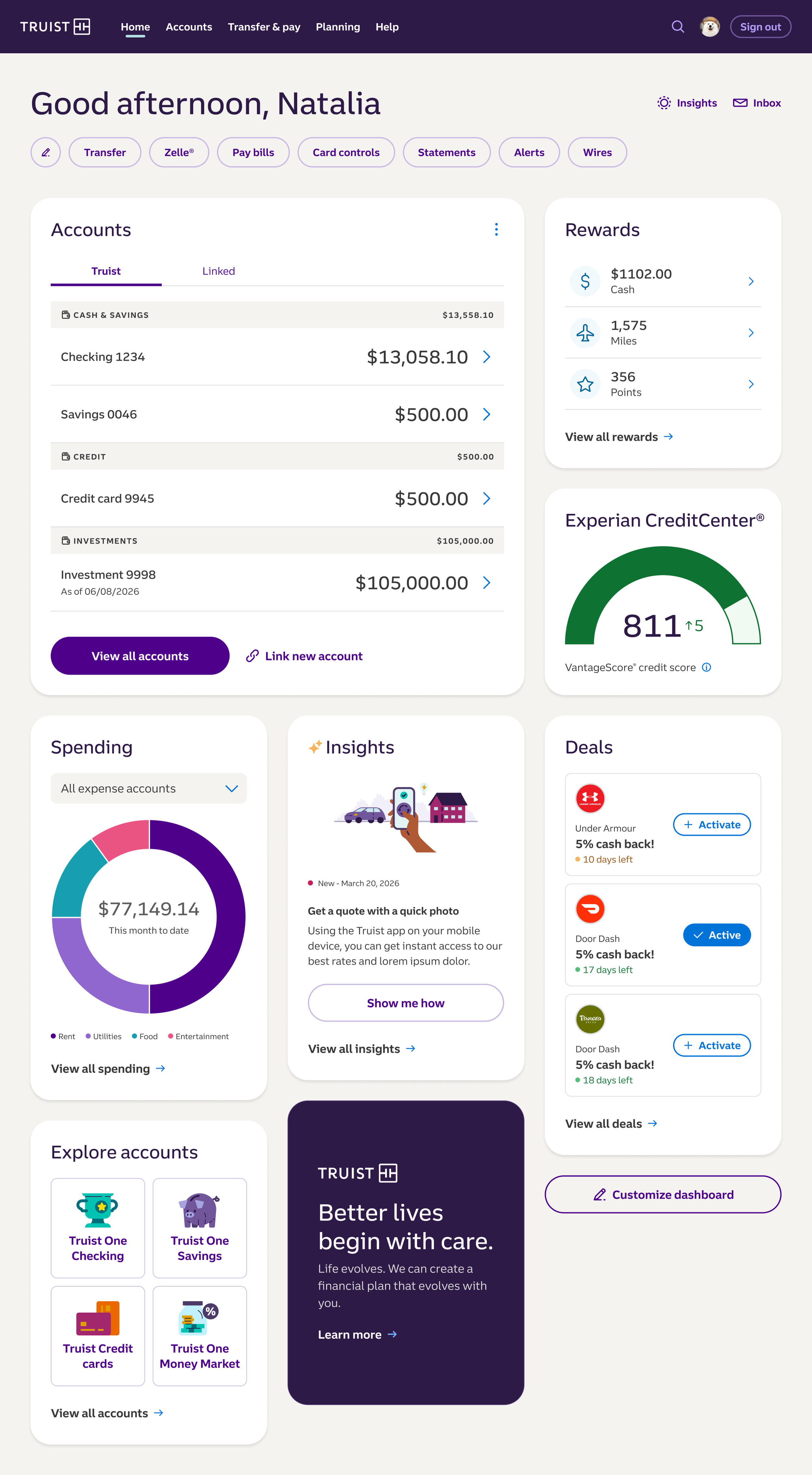
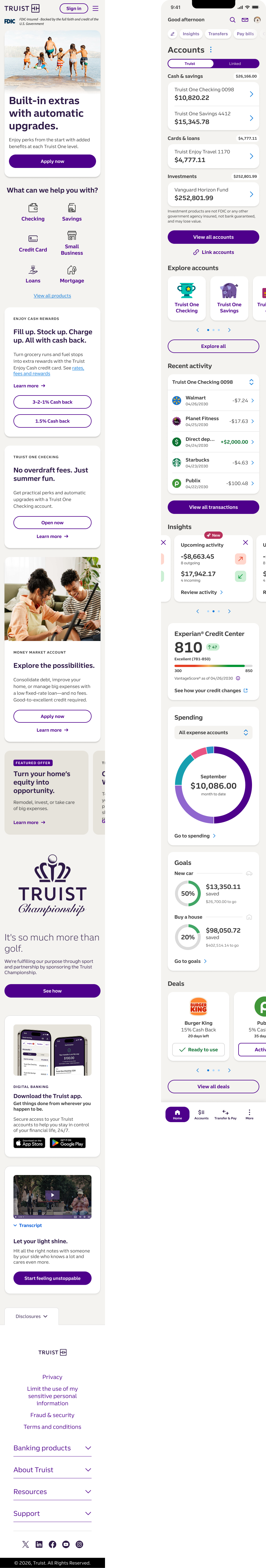
Reorganized around "What can we help you with?" to put findability first — sign-in and the bank's highest-intent products lead, with the new interactive colors making every action unmistakable.
Dense product, fee-waiver, and disclosure content restructured into a scannable, trustworthy story that walks customers from value prop to "open now" without losing the fine print.
A proof-of-concept redesign of the authenticated experience. Accounts, spending, insights, credit, and rewards are organized into a calm, scannable hierarchy — with the warm off-white base pushing cards forward and letting the Truist purple lead the eye.
The new homepage and Online Banking dashboard carry DL 2.2's hierarchy, color, and spacing into mobile - where most customers actually bank.
A new affluent-tier banking product — and a 2026 Truist organizational top priority — shaped end to end, from product strategy to launch.
Role & context
Design Director over Truist.com
Design leadership across the full product lifecycle. I was involved at every step of bringing Truist Premier to market: early product strategy with the line of business, marketing workshops, design strategy, user research, and final design direction - now launched as one of Truist's top organizational priorities for 2026.
The challenge
Affluent clients have high expectations and real choice. Truist Premier had to signal premium value, personalized advice, and trust across a dense set of benefits and planning services — while staying unmistakably Truist and riding the new design language.
The approach
I worked across the whole lifecycle rather than parachuting in at the design phase. I partnered with the line of business on early product strategy, ran marketing workshops to align positioning, set the design strategy, and grounded decisions in user research before converging on the final design. The result connects the pieces an affluent client cares about - premium banking benefits, a dedicated Premier Advisor and personalized financial planning, and rewards that scale with the relationship - into one coherent, confidence-building experience.
The outcome
Launched in 2026 as a Truist organizational top priority: a new affluent-tier product, now live and in market.
Skills: End-to-end product design · Product & design strategy · Cross-functional partnership (LOB + marketing) · UX research · Affluent / financial services UX · Go-to-market
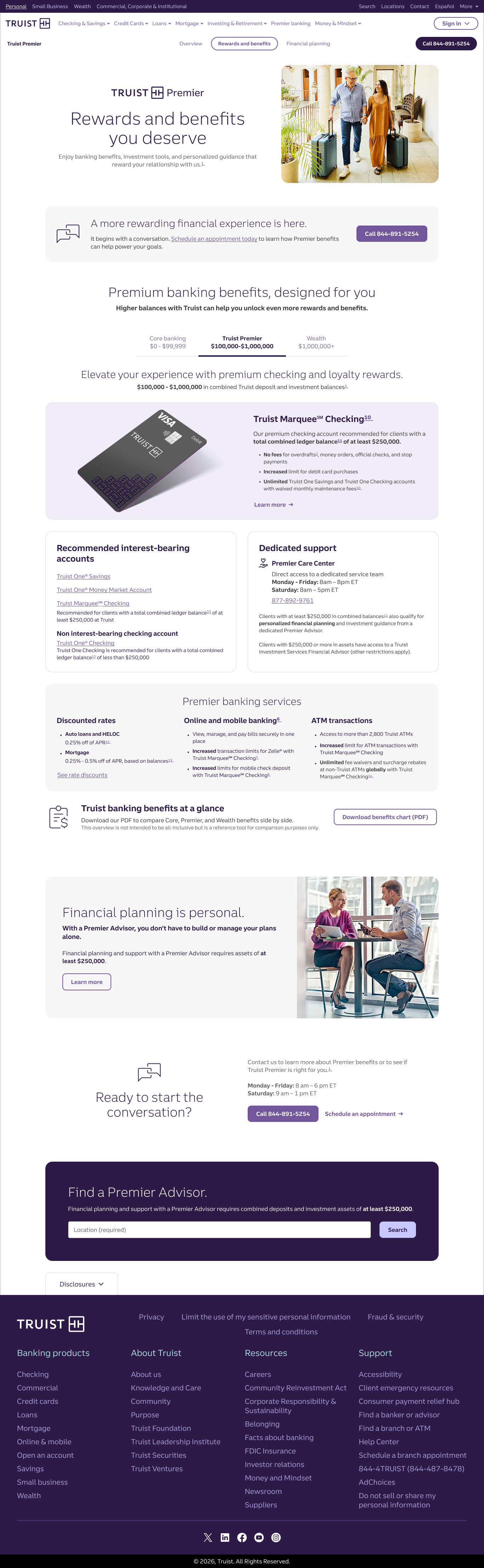
The front door to Truist Premier — it frames the premium value proposition, previews banking benefits and dedicated advisor support, spells out eligibility, and answers the top questions up front to build confidence before a client commits.
Premium banking, relationship-based rate discounts, credit card loyalty bonuses, and dedicated support - concrete rewards that scale as the client deepens their relationship with Truist.
The advice story - a personalized plan built side by side with a dedicated Premier Advisor, structured around a clear four-step process and five planning fundamentals so guidance feels human, not transactional.
The a collection of founding design work behind Truist.com - original template concepts designed, tested, and built to stand up a brand-new bank's digital experience from scratch.
Role & context
Design Director over Truist.com
From August 2020 to October 2021, my team was tasked with designing, testing, and building out the Truist.com user experience from the ground up - Truist.com and segment homepages, product pages, the financial wellness experience, search and help center, and supporting marketing strategies.
The challenge
A newly formed bank standing up its digital presence had no existing template system to lean on. Every core pattern - how products are presented, how customers navigate, how value is communicated - had to be designed, tested, and built from a blank page, fast and at scale. Over 6000 pages in total need to adopt these templates.
The approach
We worked end to end: concepting patterns, testing them with users, and building them out across the full range of Truist.com surfaces. The output was a foundational library of reusable templates - data visualization, an interactive product experiences, cross-sell modules, and value-proposition and product-selection patterns. These were designed to scale across four different product segments.
The outcome
These concepts became the foundation Truist.com launched on - and the groundwork that later evolved into the site optimization and design-language work that followed.
Skills: Foundational design systems · Template & pattern design · Prototyping · UX research & testing · Homepages & product pages · Financial services UX
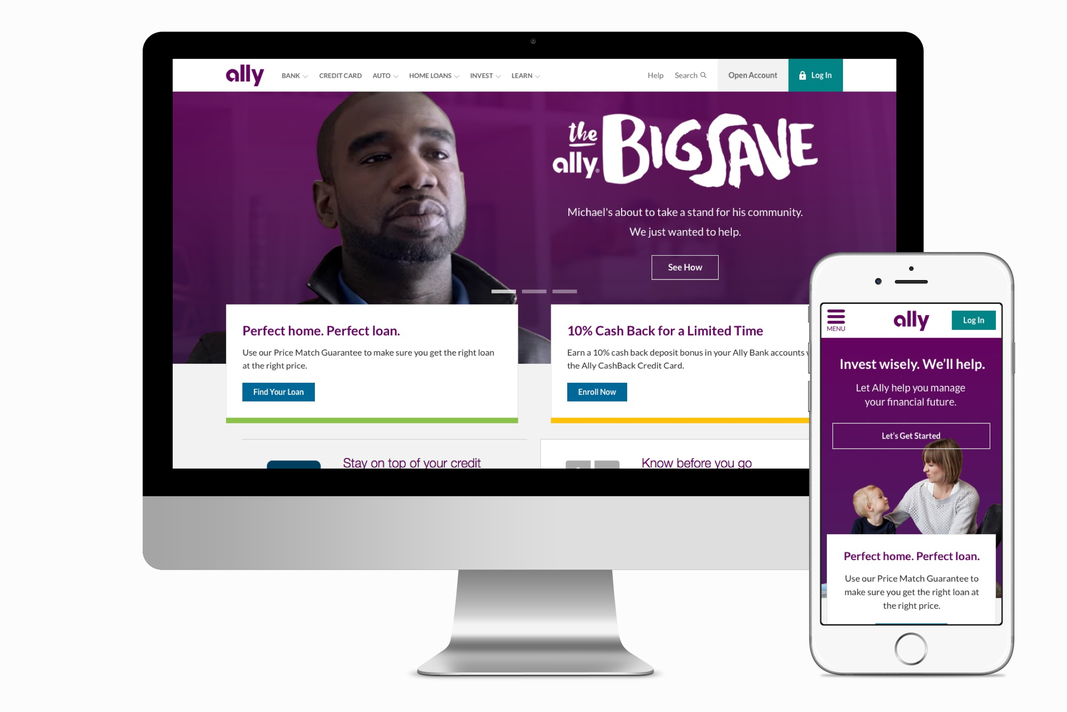
A concept to modernize Ally.com's homepage — untouched since 2010 — by bringing Ally's full product lineup to the storefront through an SEO- and education-driven strategy.
Role & context
Design lead. I led the effort to reimagine Ally's homepage, owning art direction, iconography, and prototyping while partnering with a designer and content strategist on design direction.
The approach
Because Ally is digital-only, I built the product-prioritization strategy around two levers: SEO, so the right products are discoverable, and education, so customers actually understand them. I brought that strategy to life through art direction, custom iconography, and an Axure prototype, collaborating with a designer and content strategist to balance product visibility against brand presence.
The outcome
The concept wasn't adopted — it was deprioritized against competing initiatives — but it laid out a clear, strategy-led direction for modernizing an online-only storefront and making a full product catalog discoverable from the front page.
Skills: Art direction · Iconography · Prototyping (Axure) · Storefront & product strategy · SEO-informed design · Content strategy partnership · Financial services UX
The challenge
Ally's homepage hadn't been touched since 2010, and many of its products had no presence there at all. As an online-only bank, the homepage is the storefront — so the redesign had to surface the full product lineup and modernize the experience without diluting Ally's strong brand.
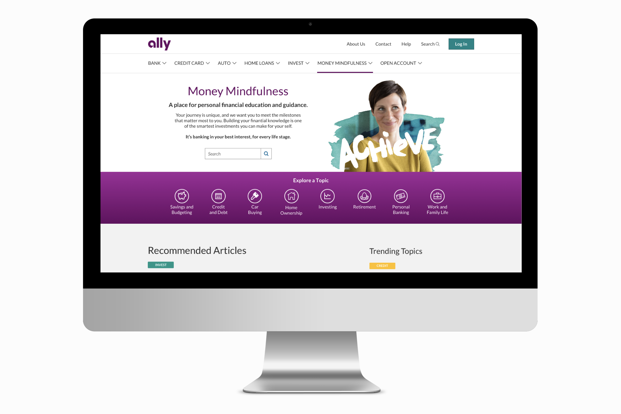
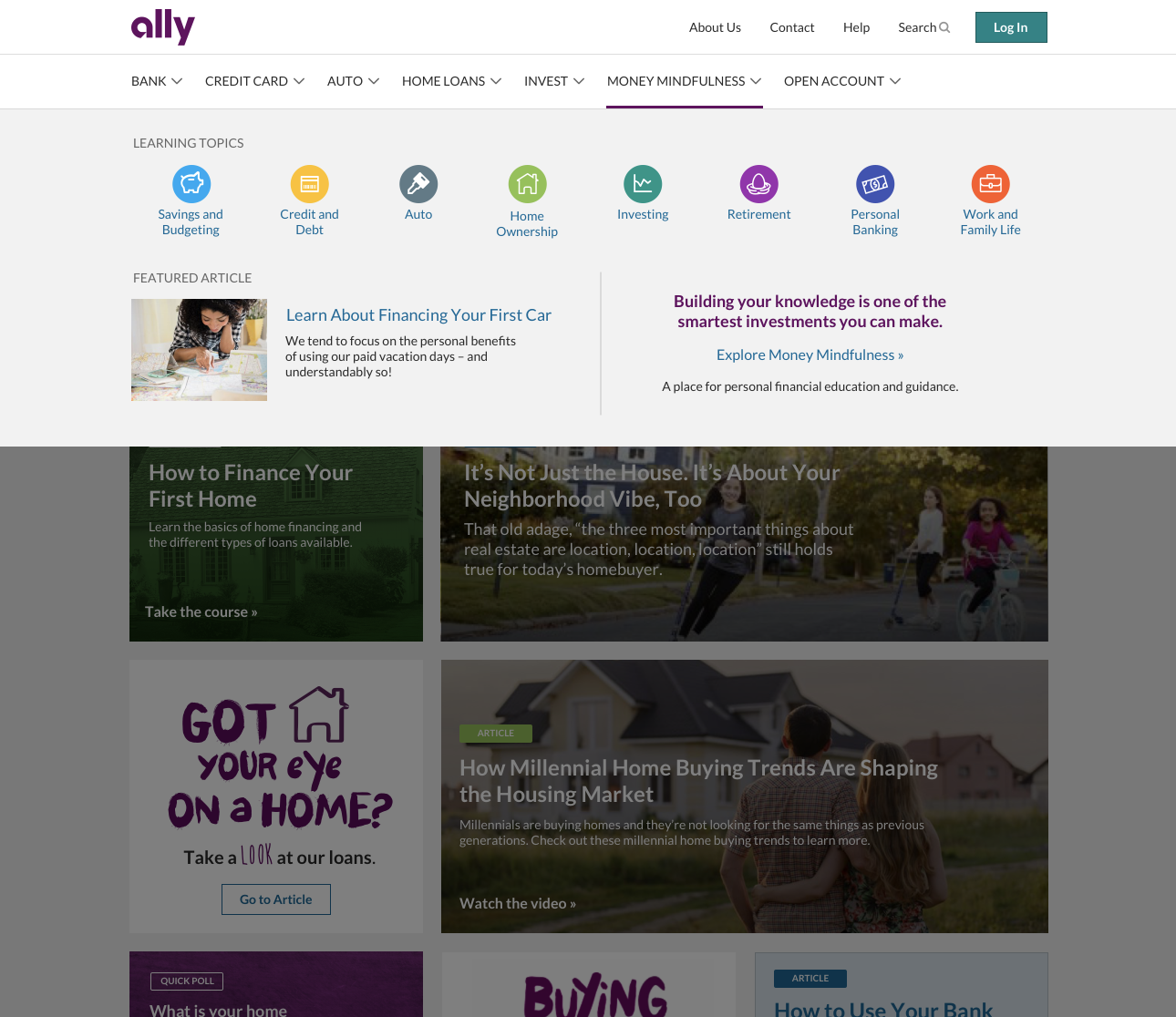
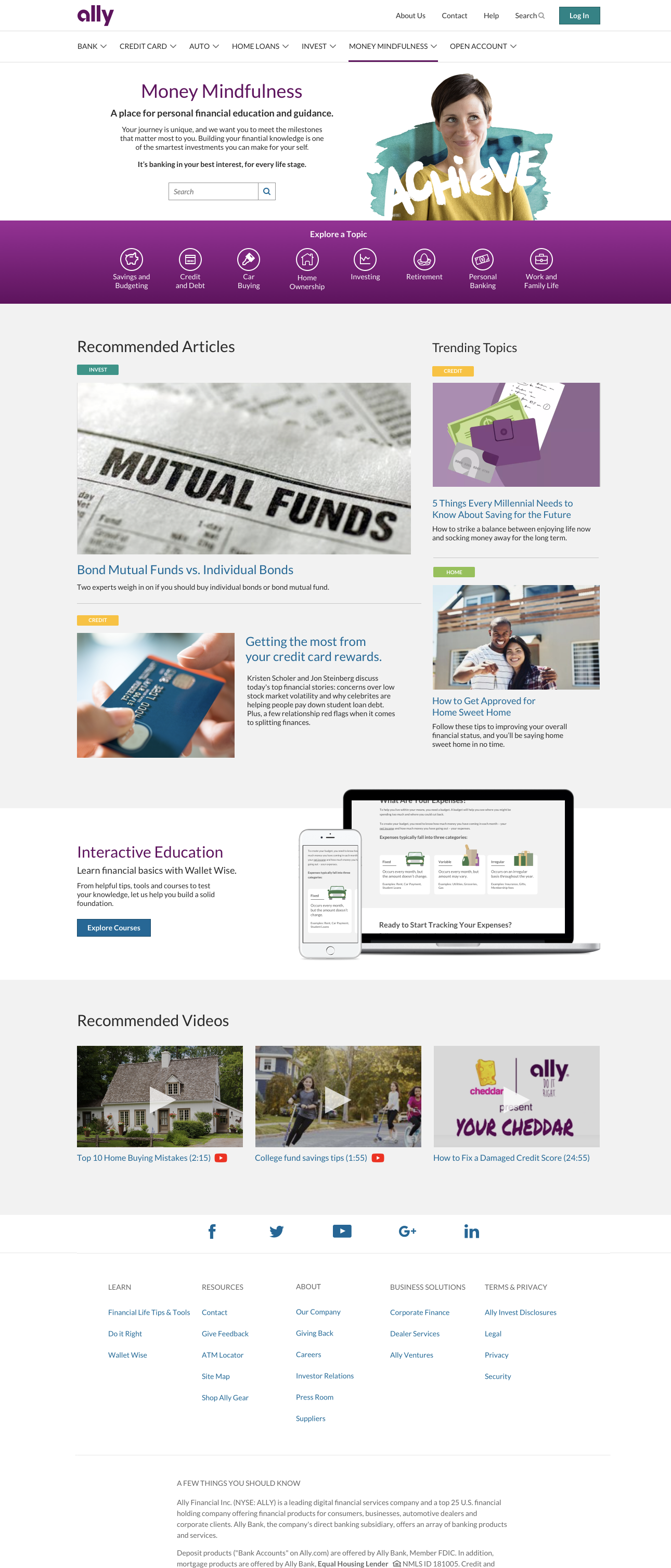
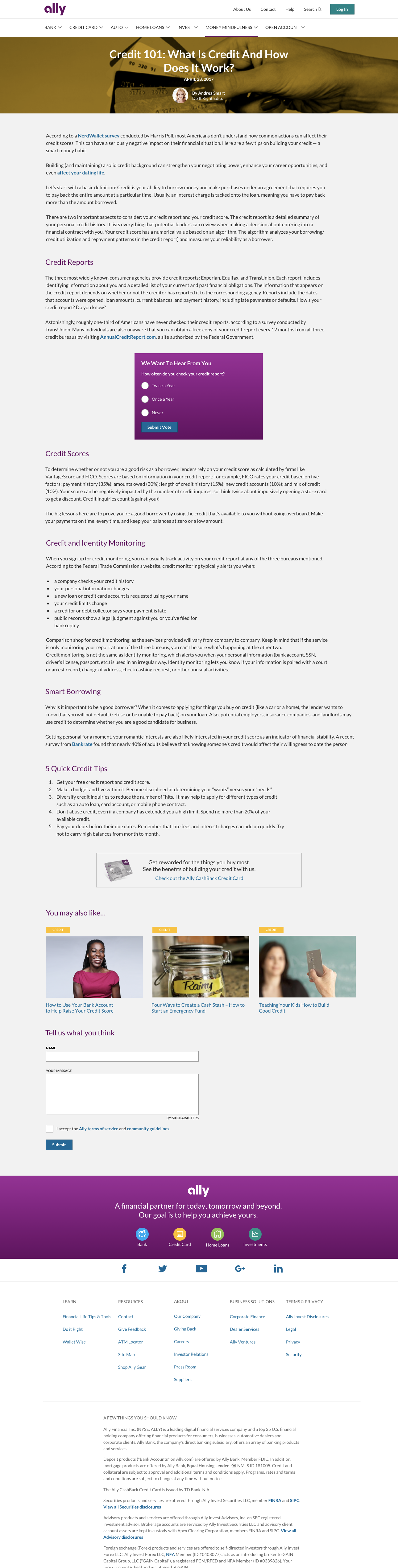
A financial-learning hub concept (circa 2018) to pull Ally's blog content, articles, videos, and tools into one place — educating clients and prospects while lifting SEO.
Role & context
Design lead, partnered with a content strategist. I owned the aesthetic, UI design, and all illustrations, helped shape the information architecture, and built Axure prototypes throughout the design process.
The challenge
Ally was producing a steady stream of financial education — blog posts, articles, videos, tools — but it lived scattered, with no single home. The opportunity was to aggregate it into one learning hub that educates clients and prospects, strengthens Ally's thought-leadership position, and improves SEO and site ranking along the way.
The approach
I designed a topic-organized hub that brings Ally's ongoing content into one categorized, browsable experience. I set the aesthetic and UI, created all illustrations to give the hub a warm, approachable identity, helped structure the IA so content is easy to navigate by topic, and prototyped the flows in Axure.
The outcome
Like the homepage concept, Money Mindfulness was shelved through reprioritization — but it defined a clear model for turning scattered content into an SEO-boosting, education-first destination.
Skills: Visual & UI design · Illustration · Information architecture · Prototyping (Axure) · Content strategy partnership · SEO-informed design · Financial services UX
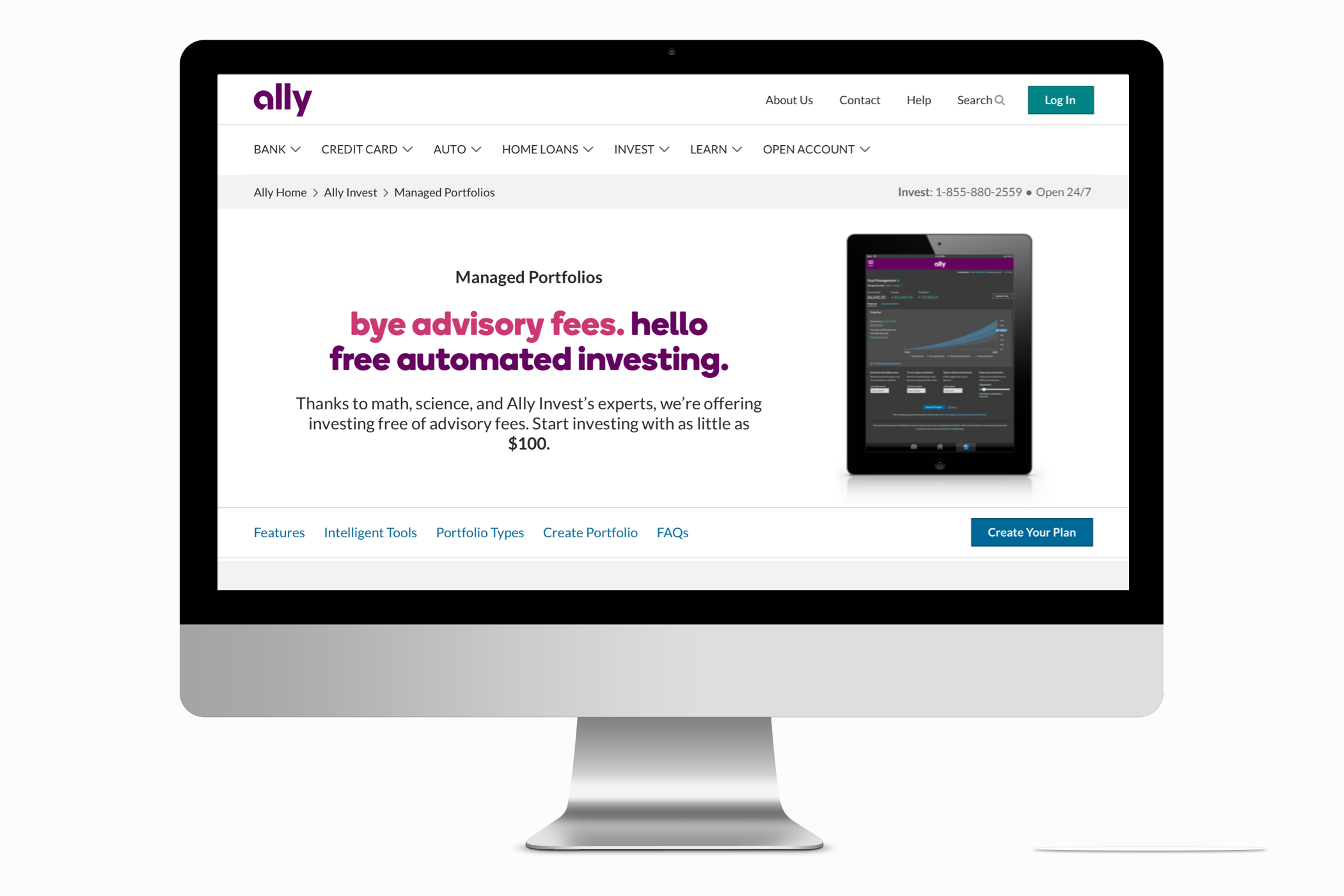
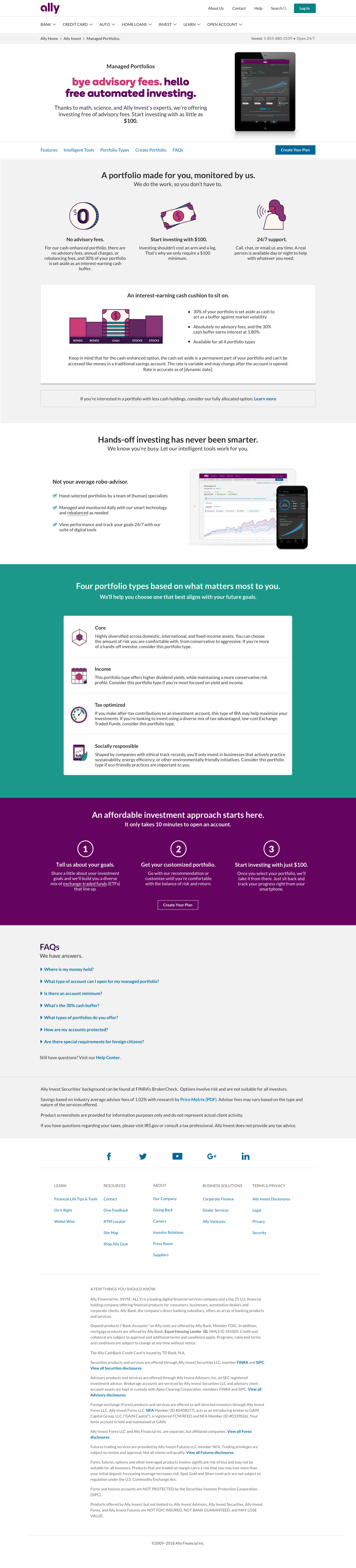
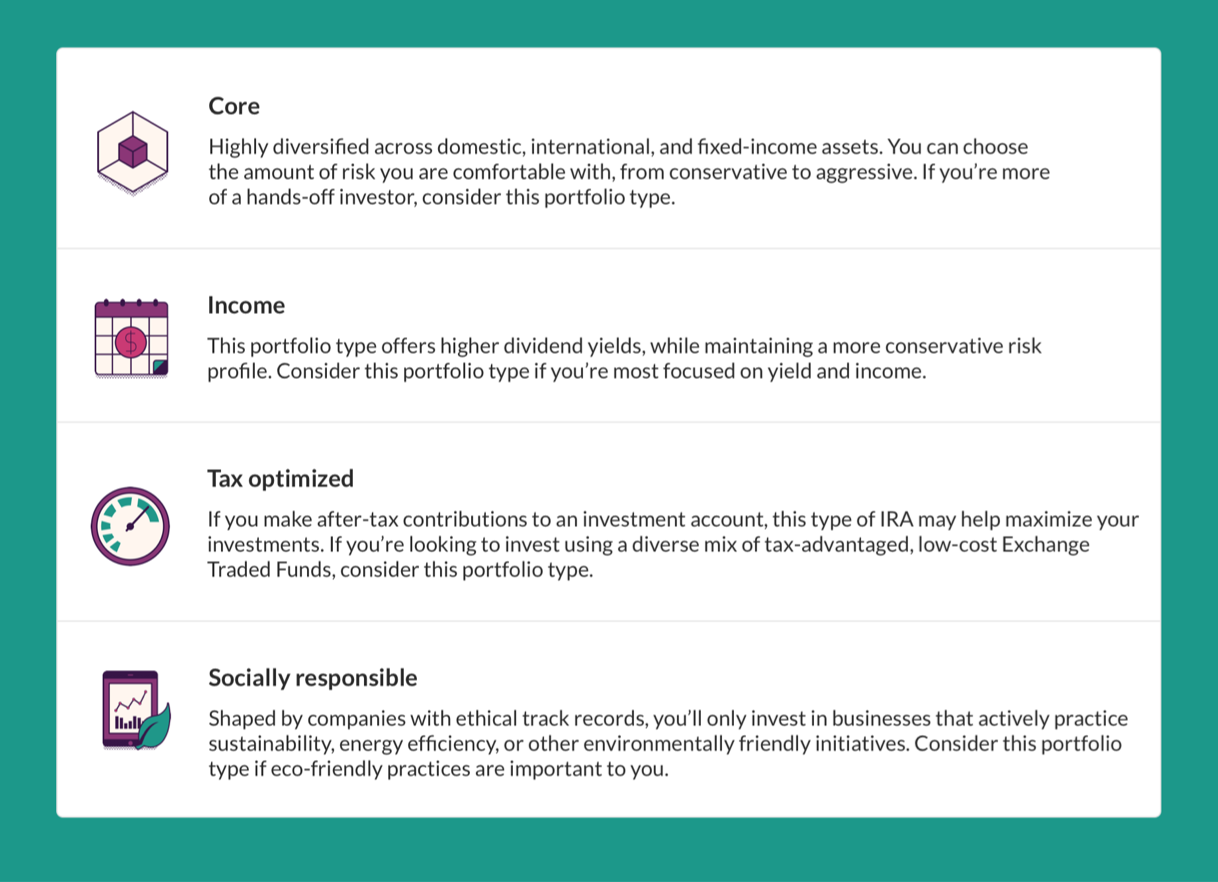
A storefront and guided experience for a net-new Ally Invest robo-advisor — launched, and the testbed for a fresh color palette and illustration approach.
Role & context
Design manager over Ally.com, and design lead on this project. I designed the experience, created the icons and illustrations, and built the page in Adobe Experience Manager, partnering with an IA and content strategist.
The challenge
Managed Portfolios was a brand-new robo-advisor for customers who want to invest with little effort. The storefront had to make hands-off investing feel approachable — helping customers choose a plan and visualize what investing with Ally could do for them, without overwhelming them.
The approach
I designed a guided storefront anchored by a questionnaire experience that narrows in on each customer's goals, then helps them pick a plan and picture the outcome. As a net-new product, it was also the chance to introduce a new color palette and illustration approach - I designed custom icons and illustrations to give it a distinct, approachable identity. I designed the site in Sketch and authored the live page in Adobe Experience Manager.
The outcome
Launched as a live Ally Invest storefront: a net-new robo-advisor product that moves customers from "I want to invest" to a chosen plan with confidence.
Skills: Design leadership · Art direction · Iconography & illustration · Visual identity & color · Guided UX & questionnaire flows · Adobe Experience Manager · Financial services UX
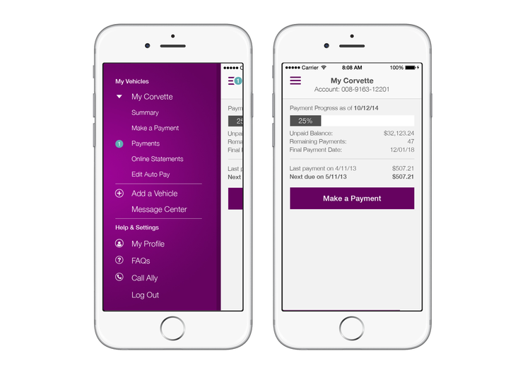
A multi-part initiative that brought a new mobile way to pay to Ally Auto customers - spanning app, a responsive storefront redesign, and onboarding.
Role & context
Senior designer, and the lead designer over Ally Auto. I led the design across the initiative, owning the visual aesthetic, all illustrations, and iconography. Shipped in 2015, it was a connected effort across three surfaces - mobile app, storefront, and onboarding.
The challenge
Ally Auto needed to introduce an unfamiliar new way to pay and make it stick. That meant designing a mobile payment experience customers would trust, modernizing the storefront to a responsive, mobile-first standard, and explaining the new products clearly enough to drive adoption.
The approach
The work unfolded in three stages. It started with the Ally Auto Mobile Pay app - the new way to pay. From there I led a full responsive redesign of the Auto storefront to introduce and support the new mobile products, and finally built an onboarding flow that walks customers through setup with confidence. Across all three I set the visual direction and created the illustrations and iconography that made the experience approachable and unmistakably Ally.
The outcome
Shipped in 2015 across app, storefront, and onboarding - a connected mobile-payment experience that brought a new payment method to Ally Auto customers. (The live product has since evolved well beyond this work.)
Skills: Mobile app design · Responsive web design · Onboarding UX · Illustration & iconography · Art direction · Financial services UX
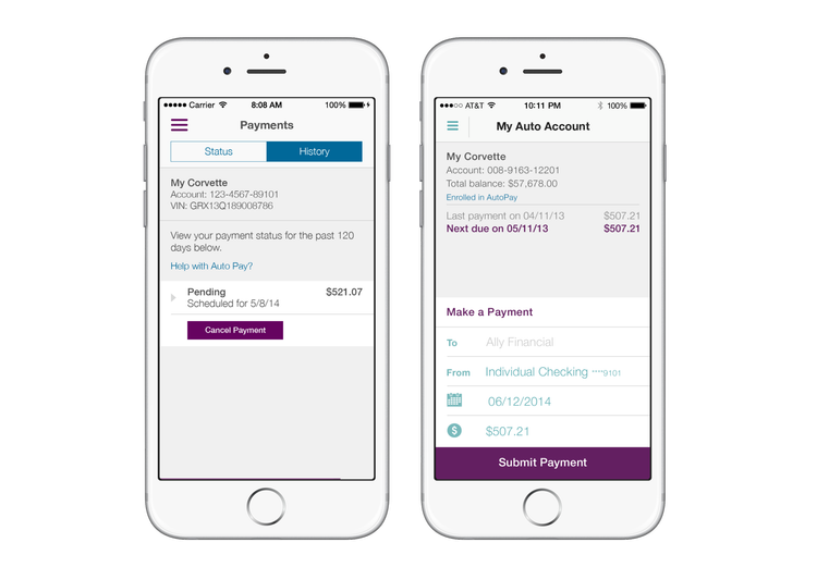
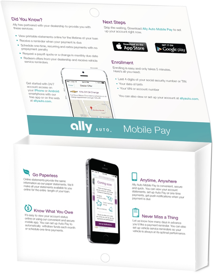
Ally’s first mobile payment app that introduced a new, faster way to pay an Ally Auto account, designed to make an unfamiliar payment method feel simple and trustworthy from the first tap.
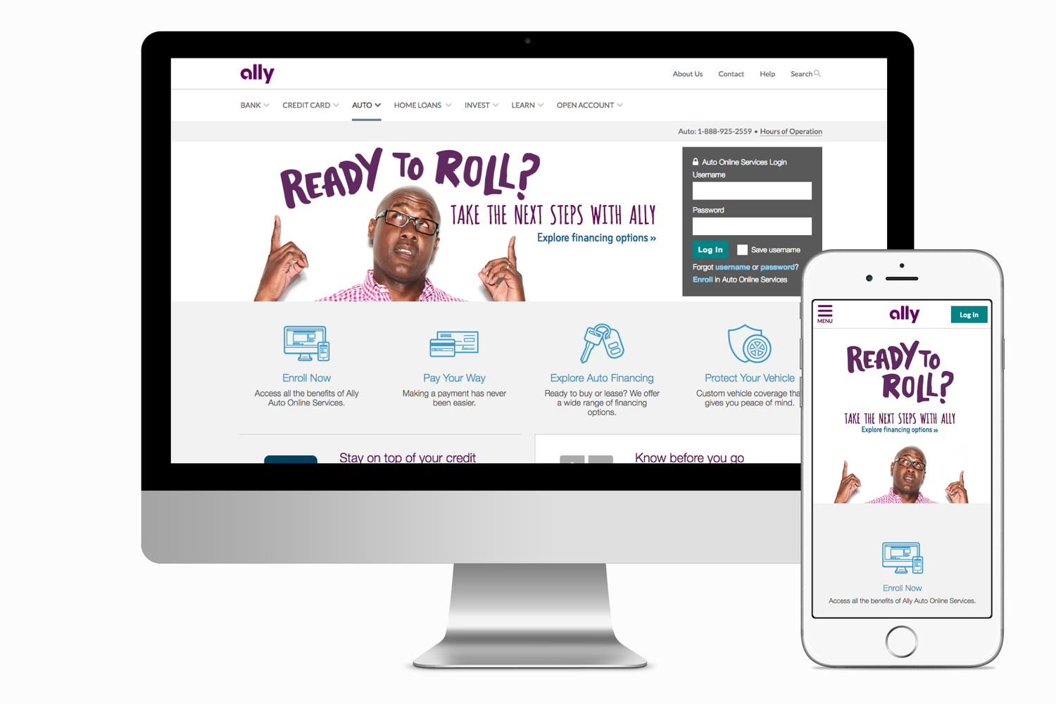
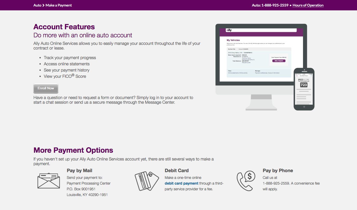
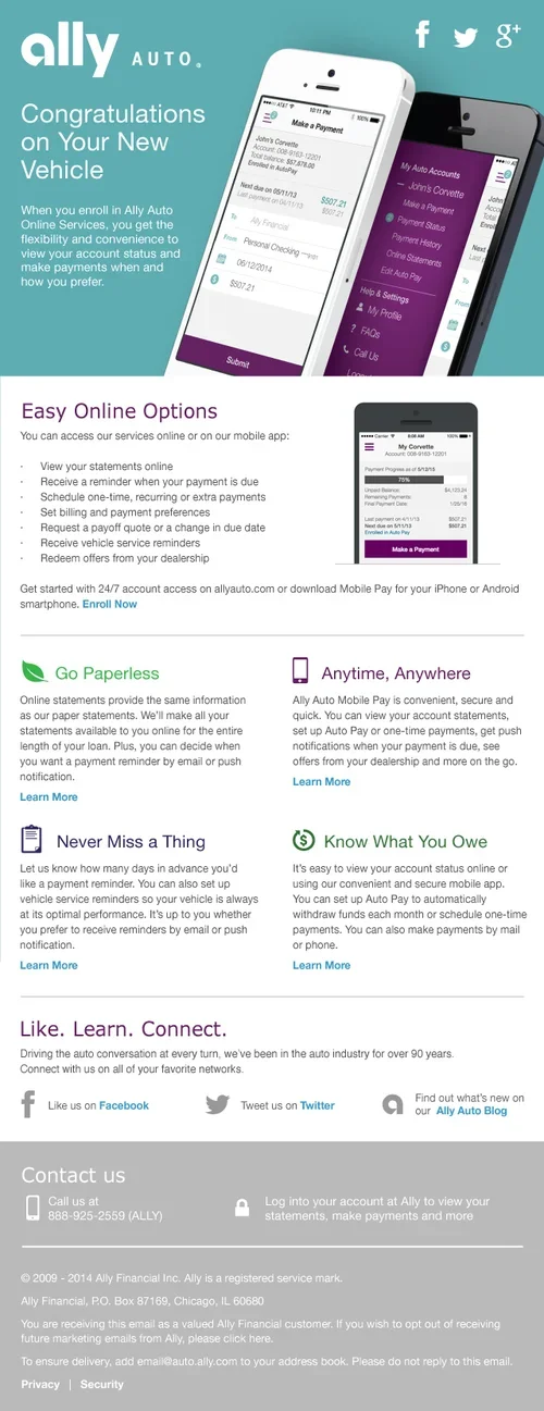
A full responsive redesign of the Ally Auto storefront, modernizing it for a mobile-first audience, introducing an authentication point, and giving the new mobile-payment products a clear home alongside existing offerings.
A step-by-step onboarding flow that walks customers through setting up Mobile Pay with confidence — turning a new payment method into something easy to adopt.